Home > Using PhotoFrame > Adding an Instant Frame
Adding an Instant Frame
Instant Frame allows you to create a custom frame from a basic shape. Each shape provides different Shaping Controls giving a wide range of flexibility in creating both common and unusual shapes. Instant Frames are a great way to create simple keyline frames as well as vignettes, mattes or color overlays. Instant Frames can be controlled with the Background, Border, Glow, Shadow, Edge and Bevel palettes just like any other element.The following shapes are available and described below:
- Ellipse
- Rectangle
- Polygon
- Star
- Arrow
- Heart
To create an Instant Frame:
- Go to the Frame Stack palette
- Click the “Add Instant” button. A new frame layer is added to the Layers Stack, and the Instant Frame palette is acivated.
- From the shape pop-up menu on the Instant Frame
palette, select the shape that you want to use.
The shape’s default settings will automatically be selected. You can manipulate the shape using the shaping controls provided for that shape. The Instant Frame palette allows you to modify or change the shape of an existing Instant Frame layer.
|
 |
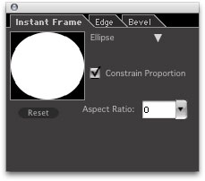 |
Ellipse
- Shape Preview: Displays a thumbnail preview of the selected shape. Shows the impact of changes using the shaping controls for the selected shape.
- Shape Selection: Allows you to choose and change shapes.
- Aspect Ratio: Varies the width of the ellipse, allowing you to create ovals.
- Constrain Proportion: When checked, constrains proportions. When unchecked, the shape expands to fit the image. Watch the image on the PhotoFrame Preview screen to see the effect of this option.
|
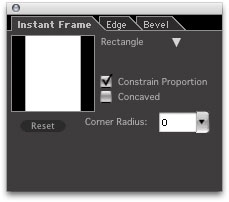 |
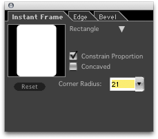
Rectangle
- Shape Preview: Displays a thumbnail preview of the selected shape. Shows the impact of changes using the shaping controls for the selected shape.
- Shape Selection: Allows you to choose and change shapes.
- Concaved: When checked, makes the corners of the shape concaved.
- Corner: Allows you to curve the corners of the shape from 0 to 100%.
- Constrain Proportion: When checked, constrains proportions. When unchecked, the shape expands to fit the image. Watch the image on the PhotoFrame Preview screen to see the effect of this option.
|
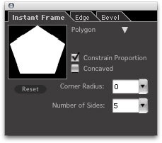 |
Polygon
- Shape Preview: Displays a thumbnail preview of the selected shape. Shows the impact of changes using the shaping controls for the selected shape.
- Shape Selection: Allows you to choose and change shapes.
- Concaved: When checked, makes the corners of the shape concaved.
- Number of Sides: Determines how many sides/corners the shape will have.
- Constrain Proportion: When checked, constrains proportions. When unchecked, the shape expands to fit the image. Watch the image on the PhotoFrame Preview screen to see the effect of this option.
- Corner Radius: Allows you to curve the corners of the shape from 0 to 100%.
|
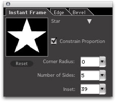 |
Star
- Shape Preview: Displays a thumbnail preview of the selected shape. Shows the impact of changes using the shaping controls for the selected shape.
- Shape Selection: Allows you to choose and change shapes.
- Inset: Allows you to set the depth of the corners. A value of 0 indicates maximum depth; a value of 100% indicates minimum depth.
- Number of Points: Determines how many sides/corners the shape will have.
- Constrain Proportion: When checked, constrains proportions. When unchecked, the shape expands to fit the image. Watch the image on the PhotoFrame Preview screen to see the effect of this option.
- Corner Radius: Allows you to curve the points of the shape. A value of 0% indicates pointy points; a value of 100% indicates maximum curvature of the points.
|
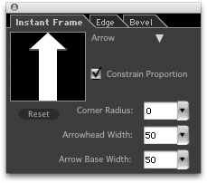 |
Arrow
- Shape Preview: Displays a thumbnail preview of the selected shape. Shows the impact of changes using the shaping controls for the selected shape.
- Shape Selection: Allows you to choose and change shapes.
- Arrowhead Width: Allows you to set the size of the arrowhead.
- Arrow Base Width: Allows you to set the width of the arrow base, or tail.
- Constrain Proportion: When checked, constrains proportions. When unchecked, the shape expands to fit the image. Watch the image on the PhotoFrame Preview screen to see the effect of this option.
- Corner Radius: Allows you to curve all the points of the arrow. A value of 0% represents the minimum curvature, yielding a pointed arrow. A value of 100% represents maximum curvature, yielding a rounded, keyhole type arrow.
|
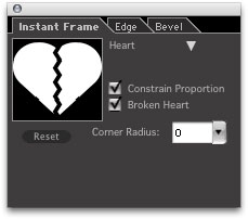 |
Heart
- Shape Preview: Displays a thumbnail preview of the selected shape. Shows the impact of changes using the shaping controls for the selected shape.
- Shape Selection: Allows you to choose and change shapes.
- Broken Heart: When checked, creates a broken heart.
- Constrain Proportion: When checked, constrains proportions. When unchecked, the shape expands to fit the image. Watch the image on the PhotoFrame Preview screen to see the effect of this option.
- Corner Radius: Allows you to curve the corners of the heart, from 0% to 100%
. |
See also
|